The tradition of using pictorial images to convey purpose to the general population is by no means a new phenomenon. In past centuries, when literacy rates were almost non-existent, local businesses used emblematic images to showcase their skills.
Now, branding is everything. In an era where everyone from multi-billion-dollar companies to Etsy sellers are looking to stand out from their contemporaries to garner attention and secure a reliable customer base, being instantly recognizable is one of the most valuable ways for a business to thrive.
Historical Logos
Early branding was less about standing out and more about simply conveying to the public what services were offered at this location. A name might be well known on a local basis or perhaps nationally if it was sufficiently acknowledged in their chosen profession. Overall branding, however, was nonexistent as competition was minimal and the concept of a global economy was barely toddling into existence.

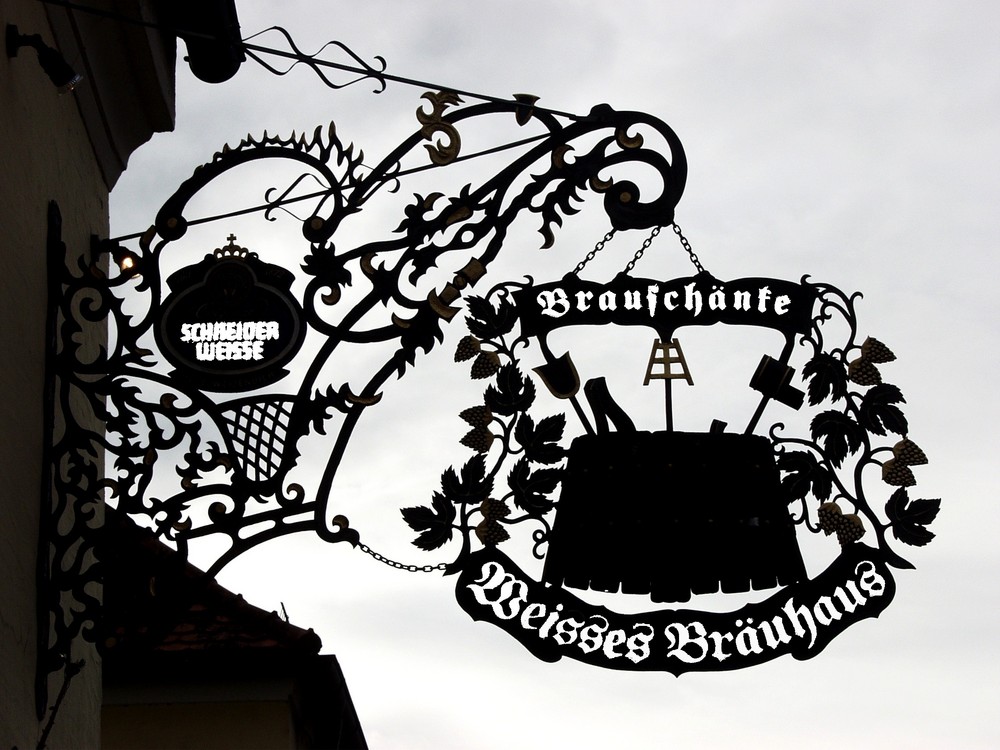

Their designs were simple, direct, and easy to understand regardless of where the customer was from or their literacy, opening their shop up to multiple opportunities. In a small town, where there might only be one or perhaps two tailors, competition for regular customers was not as strenuous as it is today.
1800s
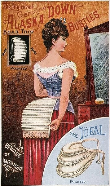
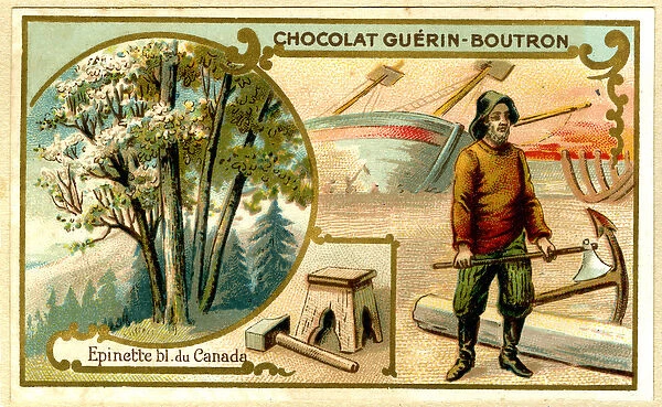
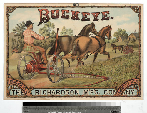
When the advent of chromolithography, or multi-color printing, became available in the mid-1800s, the idea of mass marketing began to take hold. With imports and exports now a booming industry that opened up goods and services on an international level, vivid, colorful advertisements were a notable way to attract attention to one’s business. With this came the necessity of ensuring that when potential customers saw an advert for say, baking powder, they bought your brand as opposed to competitors. So, branding and thus, logos became an important step for expanding businesses.
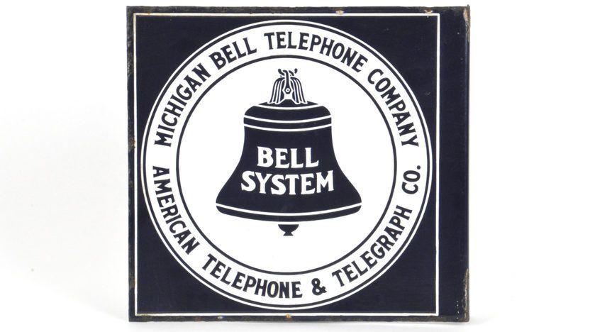
Early 1900s
In the early 1900s, commercialization became more popular within the U.S. and Europe. The idea of using pictures and emblems to appeal to communal consciousness returned to its roots. Simple, direct, easy-to-recognize logos worked their way into the public mindset, establishing brands that would later become so ubiquitous that they are often considered a part of the culture. Hand-lettering also became an explicit part of logo design, with many of these later becoming copyrighted as an inherent part of the company’s image.

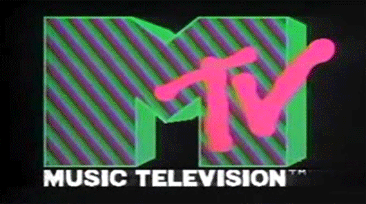
Late 1900s
It’s easy to notice the distinguishing shift of logo designs during the latter part of the 1900s, especially when looking back on the 80’s and 90’s. Extreme individuality became the standard, with focus on vivid creativity and bombastic typeface, encouraging the consumer to see themselves as rebellious or exceptional. This was especially true when appealing to younger consumers with expendable income.
2000s
While we maintain many of the historical logo designs and hold them as examples of developing customer mindsets, modern logo design tends toward the contemporary. Today, brands tend to lean towards simple, minimalistic design concepts. It is the necessary function of a brand to follow current trends, and so it follows that with social media being a permanent fixture in our lives, the simplification of logos becomes necessary for it to be easily recognized as a profile image or an app icon.

We must always look towards what comes next. But falling into a flashy big trend can be a mistake for those looking to establish themselves. Think of the most iconic brand you know and take a look back at how much their logo has changed in the last decade or so. Chances are, it hasn’t. Knowing the core concepts and maintaining the integrity of the logo design for your company is far more essential than trying to ride the zeitgeist of graphic fashion.
