As cultural trends and advancing technology become available, the client landscape alters and expects new things from creators in the modern digital marketplace. With 2023 coming to an end, it should come as no surprise that at Lion & Panda, we are analyzing the shifting field of graphic design. Each of our clients has a unique vision for their future. We like to maintain a working knowledge of tomorrow, bringing the very best of what our customer needs to their platform and helping to expand their visibility in an ever-growing consumer culture. With that in mind, we would like to give you our Top Ten Predictions for Graphic Design Trends in 2024.
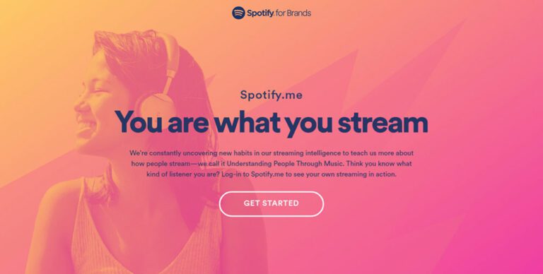
90s & Early 2000s Nostalgia
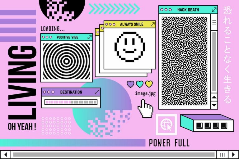
You may have noticed the recent resurgence of 90s and early 2000s aesthetics making a comeback. This isn’t limited to butterfly clips and plaid-swathed grunge apparel appearing in your local store. The design elements of the 90s had a vivid, rebellious quality that appealed to the youth-oriented culture of the time. It was bold, daring, and unapologetic in its presence, sporting vivid CMYK color schemes and funky, creative patterns to stand out from the crowd. Now we see these trends returning to the mainstream with a more structured understanding of design elements behind its concept that entices both adult nostalgic fondness and youth-oriented excitement.
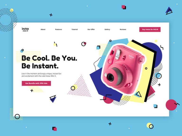
Anti-Design
Loud, aggressive, and experimental, the anti-design approach can be difficult to capture but nonetheless rewarding in its visual appeal and engagement. The purpose of anti-design is to separate itself from the conventional rules that the vast majority of designers follow when making a composition. It ignores the organized grid design in favor of creating aesthetically pleasing, yet complex a-symmetry that bucks the hyper-simplistic uniformity and frictionless commercialism that most users expect. This may sound counter-intuitive, but it can be the perfect fit for the right company, allowing for a fascinating and entrancing design scheme that challenges the user to engage on a more meaningful level.
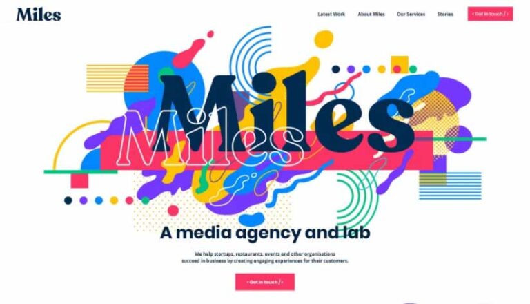
Maximalism
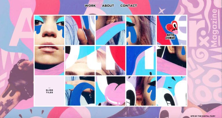
Visually expressive and bombastic, maximalism design practically forces the user to engage with its exuberance, seeking to better understand what this design is saying to them. Maximalism often includes a fierce, unrestricted approach to color, fonts, and visuals. It makes heavy use of layering, almost like a collage, without allowing any singular element to detract from the composition as a whole. This can make the end design feel confident and unafraid to take up space regardless of traditional artistic approval. When done well, it feels a bit like harnessing lighting in a bottle, giving users something that they feel driven to be a part of if only to say they had that experience.
Texture and Sensory Engagement
Since so much of graphic design is based on interacting with the customer, texture becomes a big part of the experience. Texture creates sensation, allowing the user to experience a shift in mood and a more physical grasp of what they are seeing. This can be as simple as filming the pop and fizz of a soda opening or placing an image of a fabric softener next to an infant’s skin. However, with modern customer engagement becoming an increasingly technological factor, designers are challenged to evoke tactile sensations from the other end of the screen. By placing the focus on exaggerated, yet familiar stimulations, a designer can work off haptic memory in the customer, allowing them to recall their stimulation and bring that back into the moment, perhaps craving that tactile sensory experience once more.
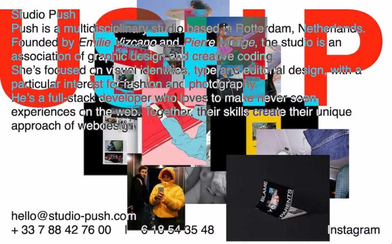
Bespoke Illustrations
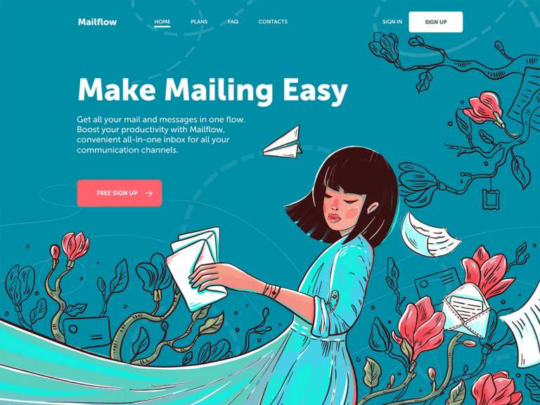
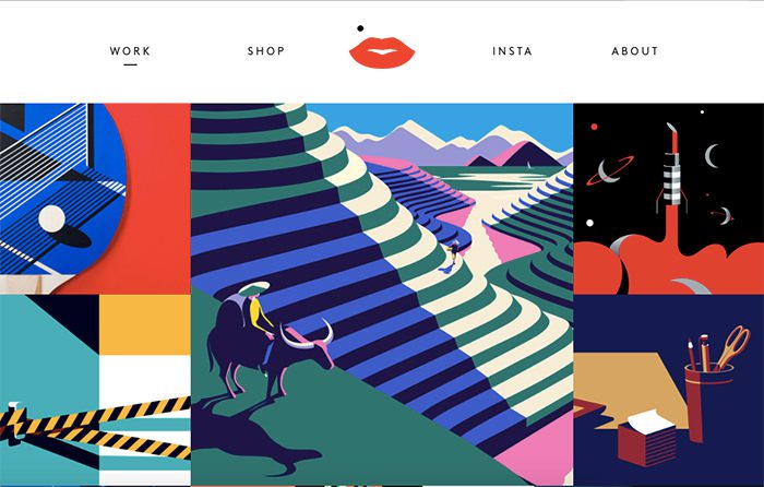
The rise of data composition images (also known as AI generation) has created quite a stir in the wider design community. Perhaps in answer to this controversy, we have also seen a rise in classic, hand-drawn illustrations and animation developing in graphic design projects. Consumers are becoming increasingly canny at seeing the distinction and often drawing a hardline as to who they will engage with. Hand-drawn elements can extend from animated mascots to one-of-a-kind fonts that add a distinctly human touch to the brand and connect with its customer base in a way that overused, data-gathered images simply do not. Illustrations can also remain versatile and adaptable as media platforms change over time, allowing the company to remain constant throughout the years without losing its originality.
Vibrant Minimalism
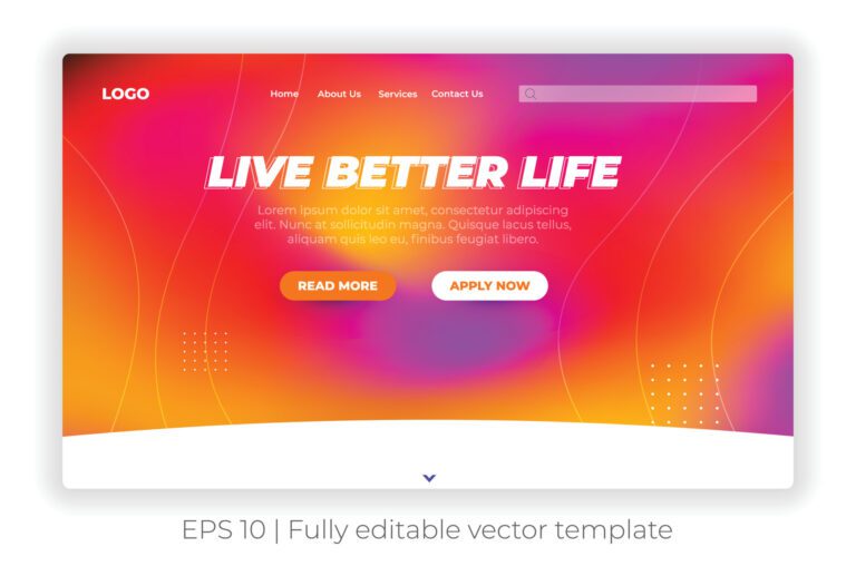
Easily defined by gripping design choices and borderless composition, vibrant minimalism makes use of its space through sheer determination and zeal. It garners a sense of intrigue in the client and their customer base without sacrificing the necessary information needed for a successful engagement. Designers utilize distinctive color choices to highlight focal points while allowing the details to remain simple, untarnished, and direct. Vibrant minimalism can be used to add a splash of delight to an otherwise dull visual, its use of rainbow gradients and eye-catching shapes evoking feelings of inclusivity and variety in the customer. This graphic trend provides both an eager welcome and a sense of security to the right business profile.
Retro-Futurism
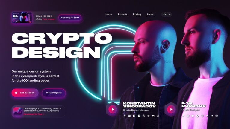
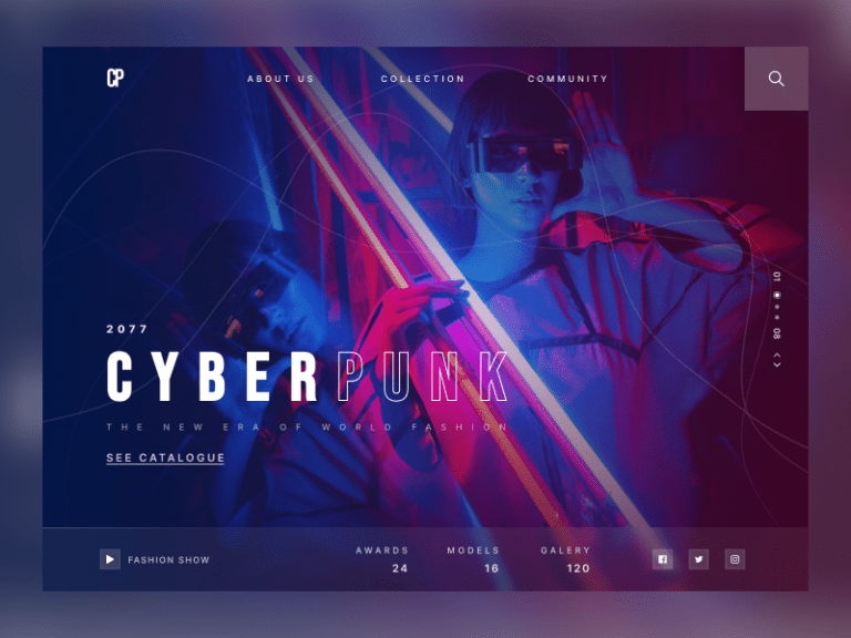
Remember the world we thought would exist by the year 2000? Combining a sense of nostalgic hope for the future with a brazen grasp of cyberpunk aesthetics, retro-futurism explores the limitless potential of humanity, always reaching for the stars. This graphic trend brings delightfully quirky design theming to the forefront of the consumer’s mind. It feels somewhat transgressive, with gritty, faded color schemes or uncompromising neon, non-existent or anachronistic technology, and stunning cosmic visuals that evoke a pop-culture sentimentality. From a graphic design standpoint, it can look deliciously tacky, like a guilty visual pleasure for the client and their customers. Its versatility is the real treasure, as a designer can include subtle elements of this trend in the composition or jump in with both feet and conquer the design.
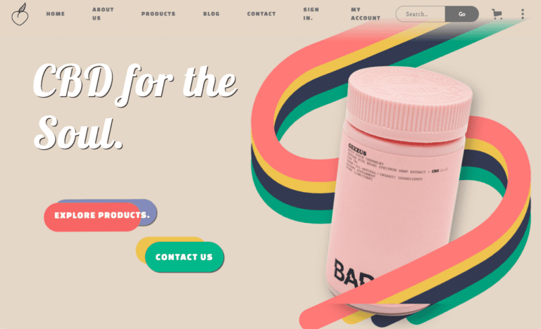
Barbie Pink
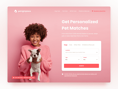
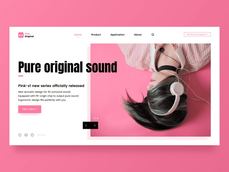
Pink is dead. Long live Pink. For a long time, this enigmatic, playful color was pushed to the side in favor of more somber, business-minded color palettes. Deemed too girly, too childish, it was to be included sparingly if at all. However, in recent years there has been a resurgence of pink as a vital part of design elements with fearless tenacity. The right shade for the right graphic allows for the utilization of sleek, elegant designs to exist alongside happy, cotton-candy excess. With the popularity of the Greta Gerwig Barbie movie still buzzing, it should come as no surprise at just how transgressive and satisfying this iconic color can be in the hands of a skilled designer.
Diversity and Inclusion
Diversity brings a renewed sense of vigor to a business’s customer engagement profile, especially online. As the industry standard expands to invite a more inclusive mindset, it becomes more important to embrace the wide spectrum of humanity beyond its most basic elements. Inclusivity allows for a wider potential base to feel ‘seen’ and acknowledged by the industry, making them more likely to engage long-term with the company and become reliable customers. How does one do this in a more practical setting? By expanding the visuals beyond stock photography and crisp, clean models in a picture-perfect setting. Seek out media that includes realistic people who represent the full and vibrant spectrum of humanity.
